Hide in Mobile Only with Web Page Builder
If you want to hide an element in the mobile or tablet view of your web page, but show it in desktop, you can accomplish this by adding a custom class to the element you want to hide, and a short snippet of custom code.
If you want to hide an element in the mobile or tablet view of your web page, but show it in desktop, you can accomplish this by adding a custom class to the element you want to hide, and a short snippet of custom code.
First add a custom class such as
.hide-in-mobile to your element.
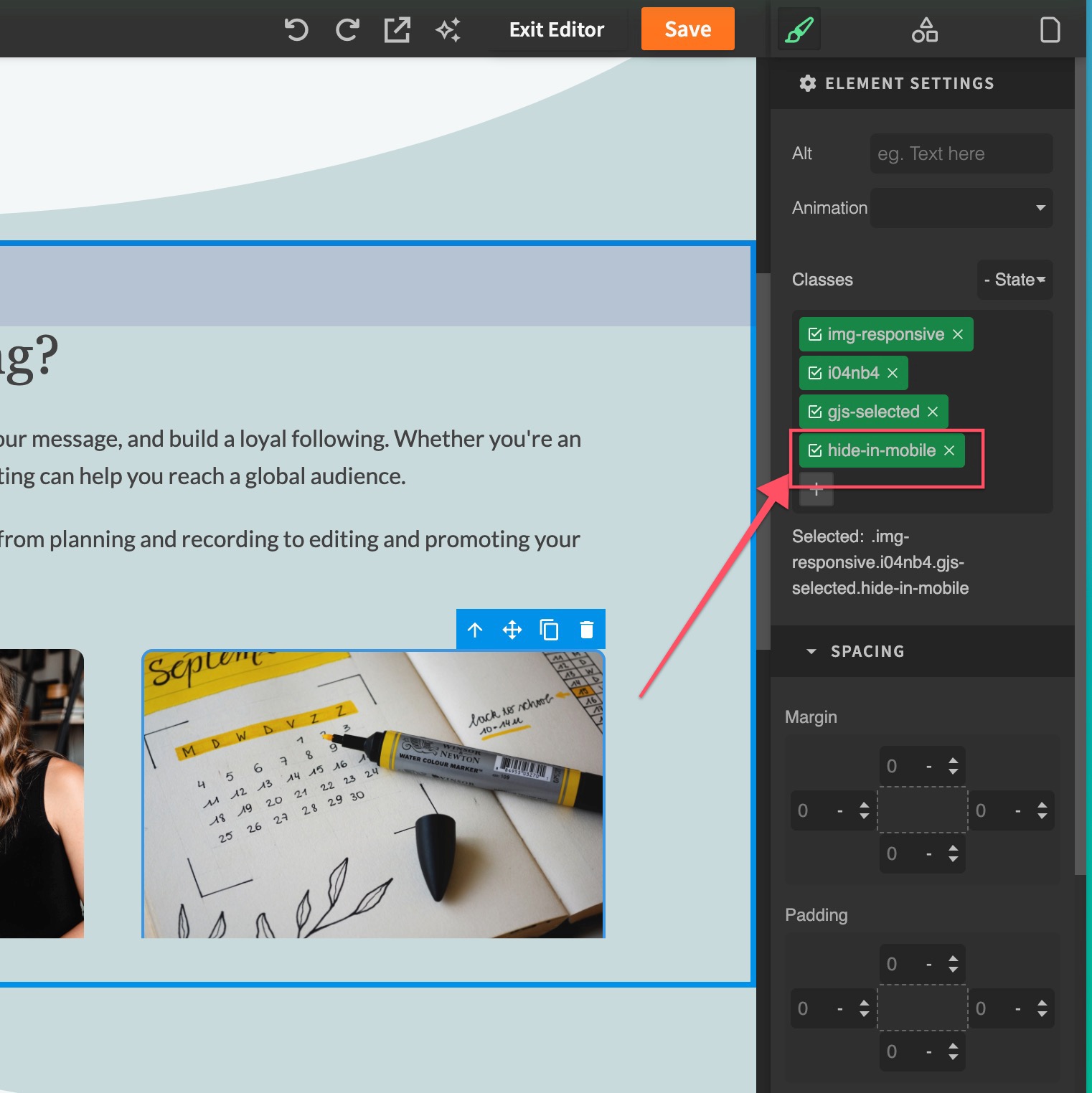
Next drag the custom code block onto the page anywhere.
Finally, paste the following custom CSS, and save your page.
<style>
@media (max-width: 767px){
    .hide-in-mobile{
        display: none;
}
}
</style>
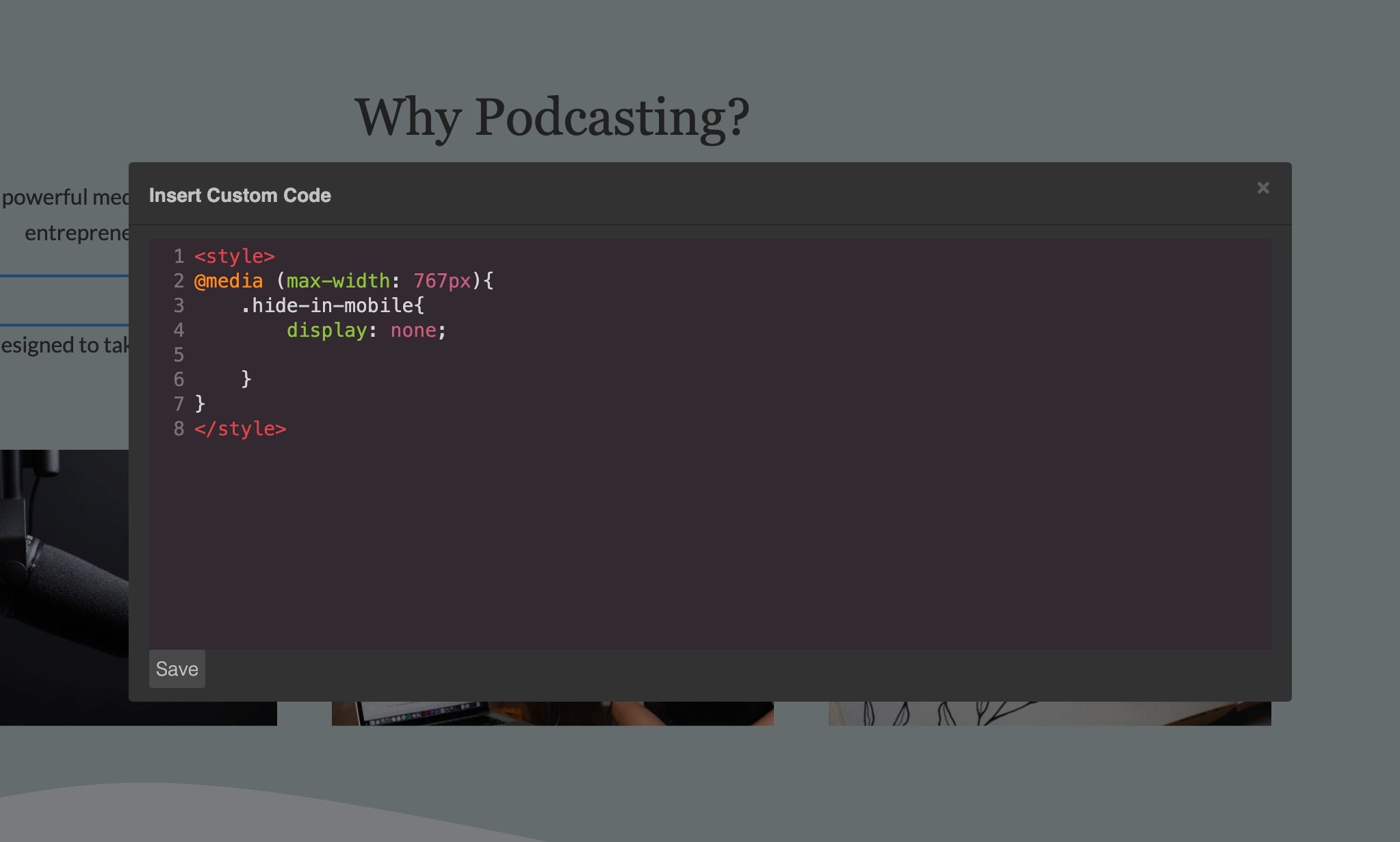
This will hide all elements that you add the class .hide-in-mobile to, when the visitor is on a mobile device.